Namabar Landing Page
Multi-channel messaging landing page — OTPs, transparent pricing, and developer trust in one scroll
2026·Product Design

Background
Namabar is a multi-channel messaging platform for sending SMS, WhatsApp, Telegram, and Viber messages—OTPs, alerts, and notifications—from one place. Teams need reliable delivery and clear per-channel rates without opaque enterprise sales cycles.
The landing page is the first handshake: what Namabar does, which channels it supports, how pricing works, and how developers get started. I designed it as a single long-form surface — hero, features, pricing, API, and conversion — with one visual language so it reads as one product, not unrelated blocks.

The Problem
Multi-channel messaging products often land in one of two traps: either they read like enterprise brochureware (vague benefits, buried docs) or like raw developer docs (powerful, but no story for a buyer skimming on mobile).
Namabar needed to earn trust quickly — per-channel pricing, integration path, and a clear try-for-free path — without forcing visitors to hunt through nav or assume hidden fees. Every section had to answer a question the previous one raised.
What I did
I structured the page as one linear scroll: hero and value prop → feature depth (Power Up) → multi-channel pricing → developer API → join and contact. Each band shares type scale, green accent, and grid rhythm so scanning still feels intentional.
Hi-fi sections were composed as full-width bands with contained content width, so illustrations and UI chrome stay legible on large screens without breaking on mobile.
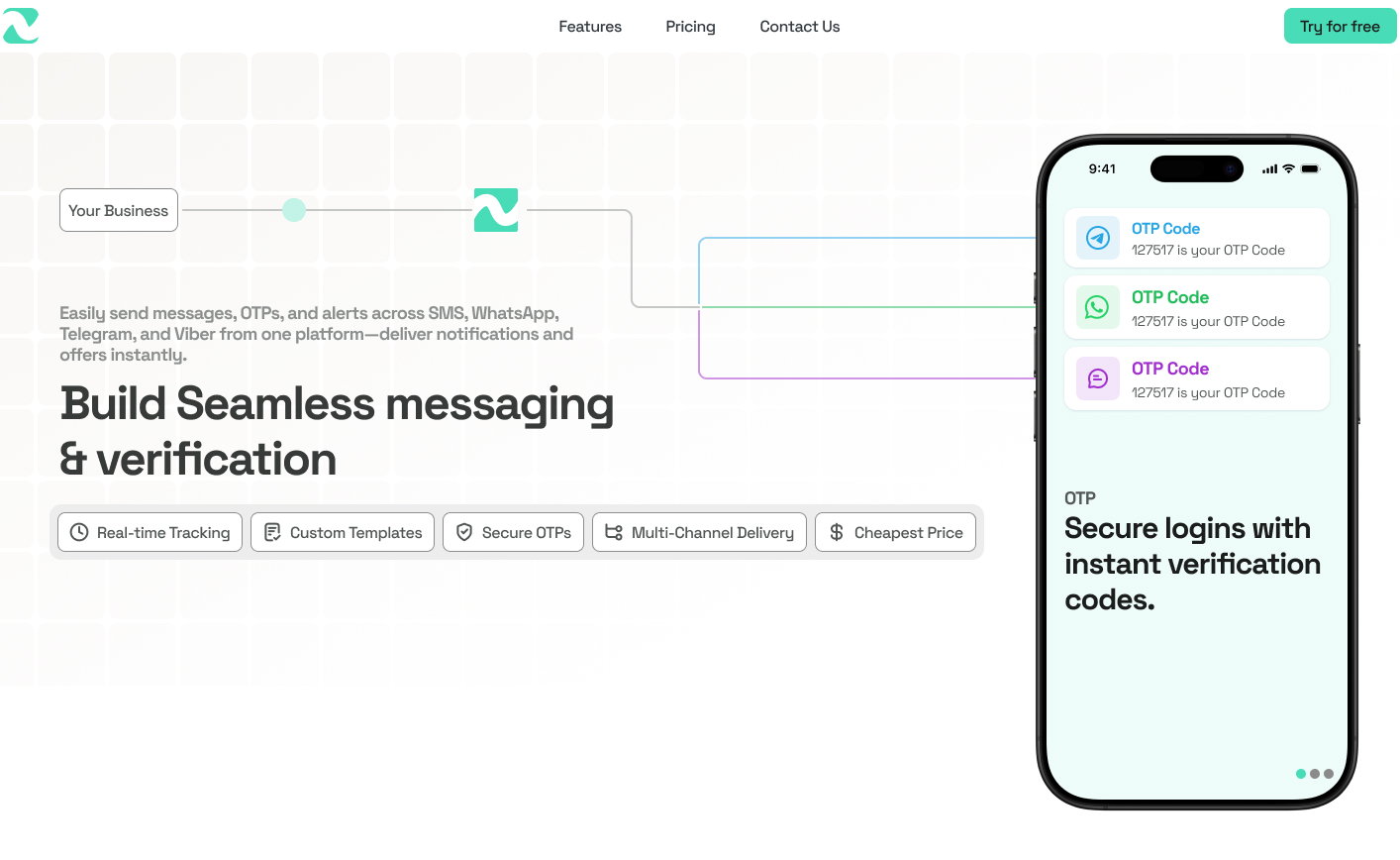
Hero
01 / 05The hero anchors messaging and verification in one headline, with channel context (SMS, WhatsApp, Telegram, Viber), feature chips, and a phone mock showing OTP delivery—enough to self-qualify before scroll.
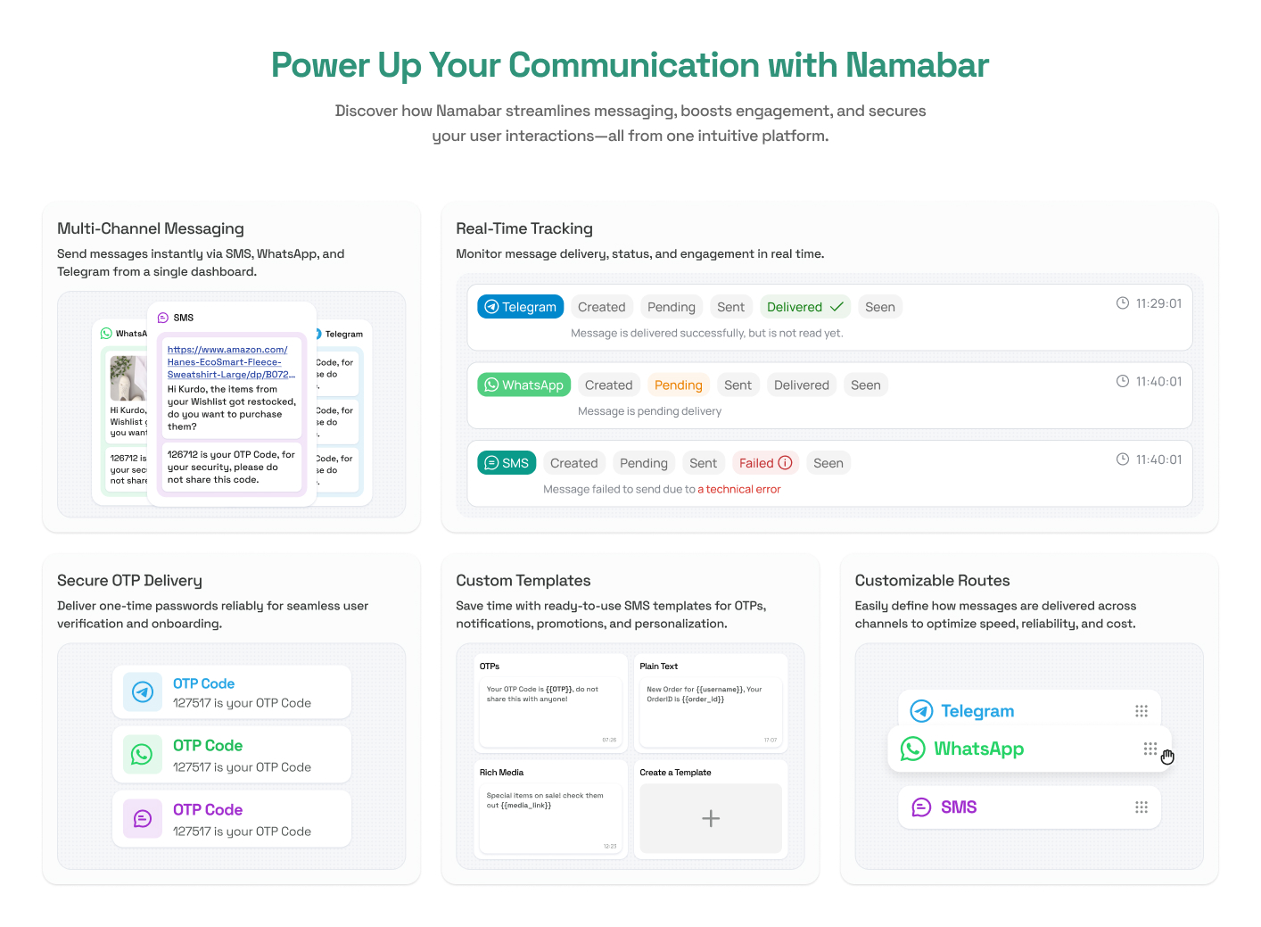
Power Up
02 / 05Five feature cards cover multi-channel send, real-time tracking, secure OTP delivery, templates, and customizable routes—product depth in scannable blocks so visitors see capability without long copy.
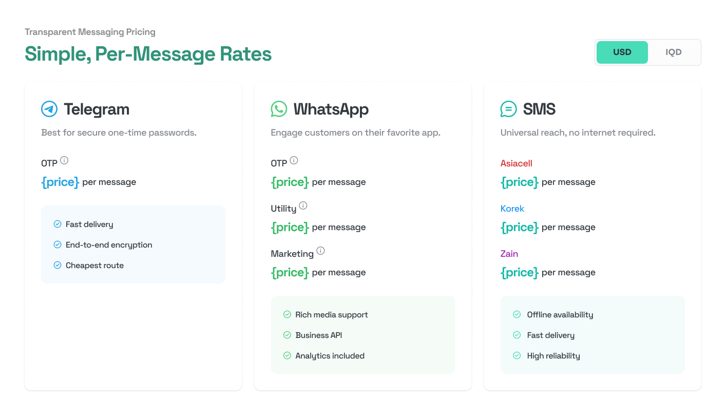
Simple, per-message rates
03 / 05Telegram, WhatsApp, and SMS each get a pricing card—OTP, utility, and marketing tiers where relevant, plus Iraqi carriers (Asiacell, Korek, Zain) for SMS. A USD / IQD toggle keeps rates legible for local and international buyers.
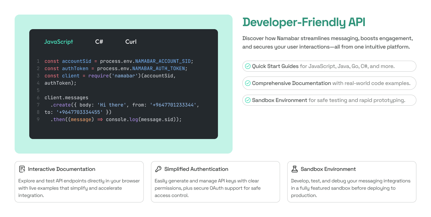
Developer-Friendly API
04 / 05Code tabs (JavaScript, C#, cURL), quick-start bullets, and three cards for interactive docs, API keys, and sandbox—so engineers see Namabar as buildable, not bolted on after a sales deck.
Join Namabar
05 / 05The closing band pairs Try for free with floating product UI, a speak-with-an-expert block (phone, email, hours), and a full footer—conversion and contact without re-explaining the product.

Results · Key takeaways
The landing page exists as a complete marketing UI direction: one scroll from hero → features → multi-channel pricing → developer API → join, with shared typography, green accent, and band rhythm throughout.
Key takeaways
- Multi-channel products sell on clarity — per-channel pricing and integration belong in the main scroll, not behind nav or contact forms.
- Marketing pages are sequences — each section should answer the doubt the previous one created; hero hype without rates or API detail feels hollow.
- Developers are a primary audience — code tabs, docs, and sandbox cues can do more work than generic “enterprise-ready” copy.