Compoundia
A from-scratch admin system for running compounds — people, properties, and day-to-day operations in one place
2026·Product design
Background
Running a compound means juggling residents, units, ownership, services people pay for, and staff who all need different levels of access. Most teams don’t get a purpose-built tool for that — they stitch spreadsheets, chats, and generic software together and hope nothing important falls through.
Compoundia is a staff-facing web admin I designed from a blank page: one consistent place to see what’s going on, act on it, and feel confident you’re not about to break someone’s record or bill.
The Problem
There wasn’t a compound management experience that matched how people actually work — quick lookups, repeat tasks, and moments where you need to be sure before you click. Without that, day-to-day work feels slower than it should, and small mistakes carry outsized stress.
The hard part isn’t drawing one nice screen; it’s holding a whole domain in one head — who lives where, how properties roll up into groups, how products and payments attach to real life — and making the UI carry some of that weight instead of dumping it on the person at the desk.
System UI & components
I treated the admin like a small design system in context: shared navigation, tables, form controls, dialogs, and empty states so every screen feels like the same product — not a one-off mock.
The sections below walk through how those pieces show up in real flows — from the portal through dashboards, forms, data-heavy views, careful actions, nesting, and Kurdish RTL.
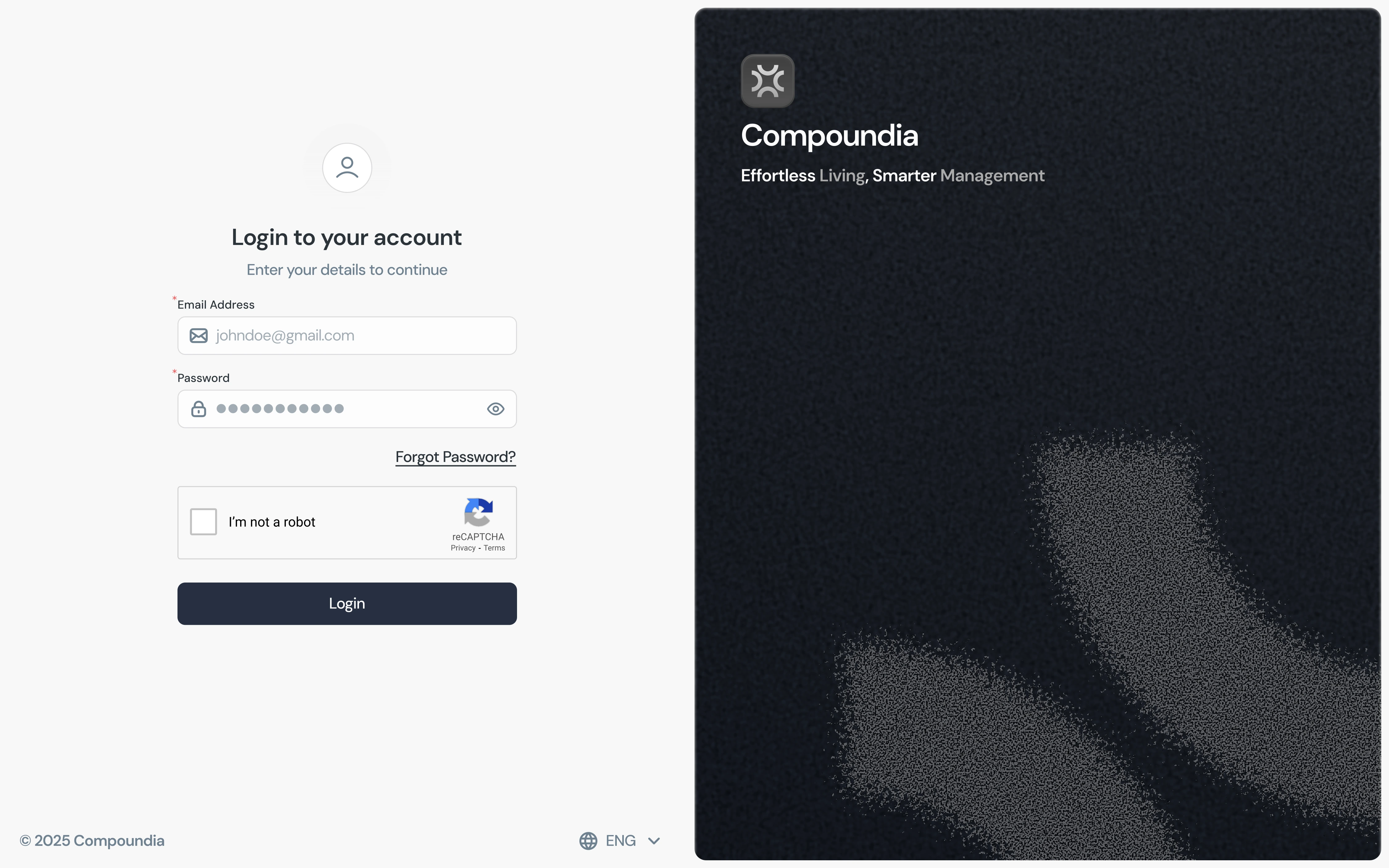
The portal
01 / 07The sign-in is intentionally quiet: email and password, one clear primary action, and no chrome fighting for attention before you’re inside the app. It sets the tone for everything after.
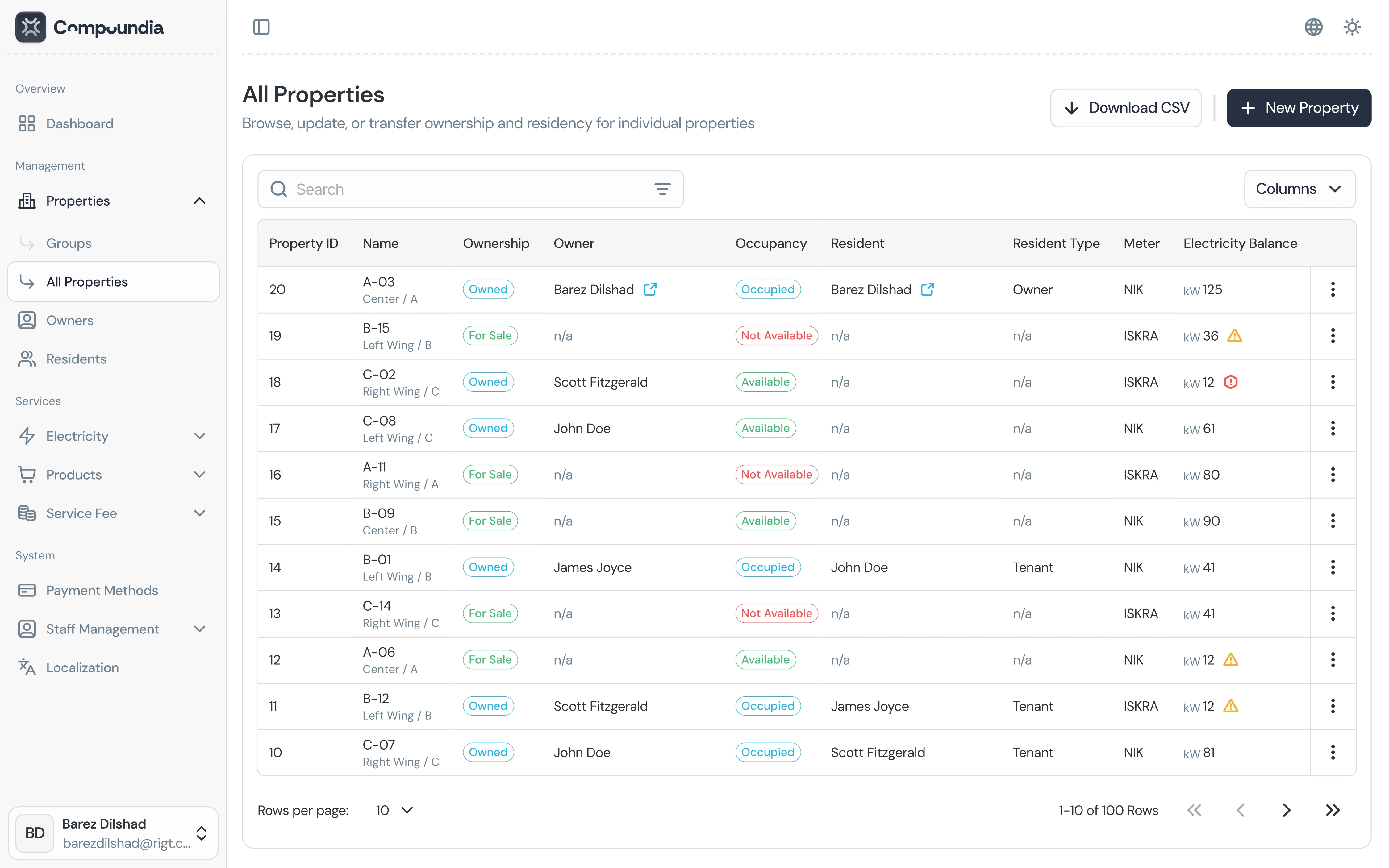
Dashboards
02 / 07Directory-style dashboards carry most of the day: search, filters, status chips, and a table rhythm you can scan without losing place. The goal was “busy work that still feels calm.”
Forms
03 / 07Long forms use clear grouping, field hierarchy, and retrieved states so staff know what’s already on file versus what they’re adding. Labels, hints, and actions stay aligned so the form reads top-to-bottom without surprises.
.webp)
Data iterator
04 / 07For long lists I used a consistent iterator pattern (page size, counts, prev/next) so people can move through data without guessing where they are in the set — same controls wherever pagination shows up.
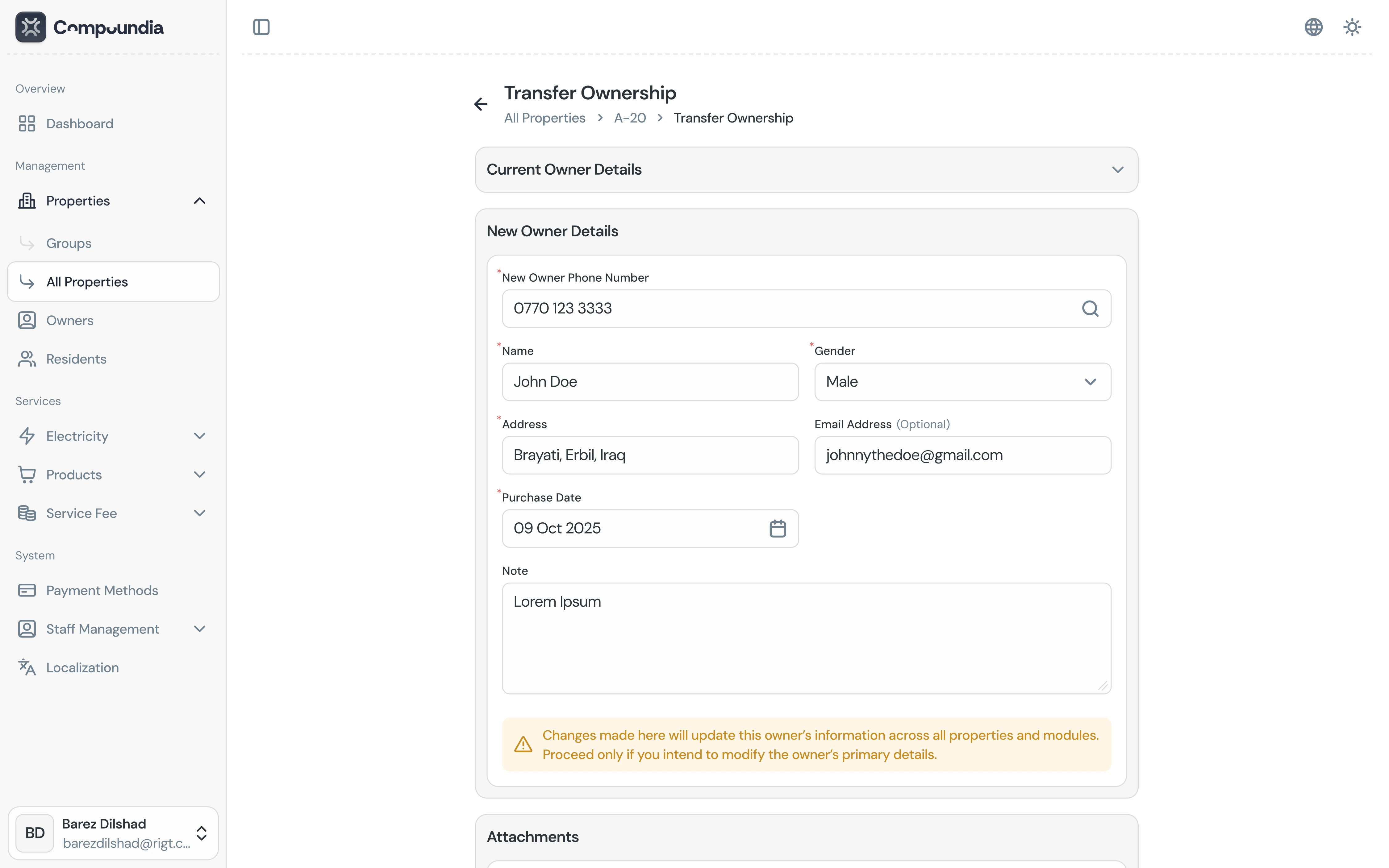
Detailed actions
05 / 07High-stakes flows like ownership transfer get stepped layouts, explicit copy, and room to read before committing — the UI should feel careful when the underlying change is serious.
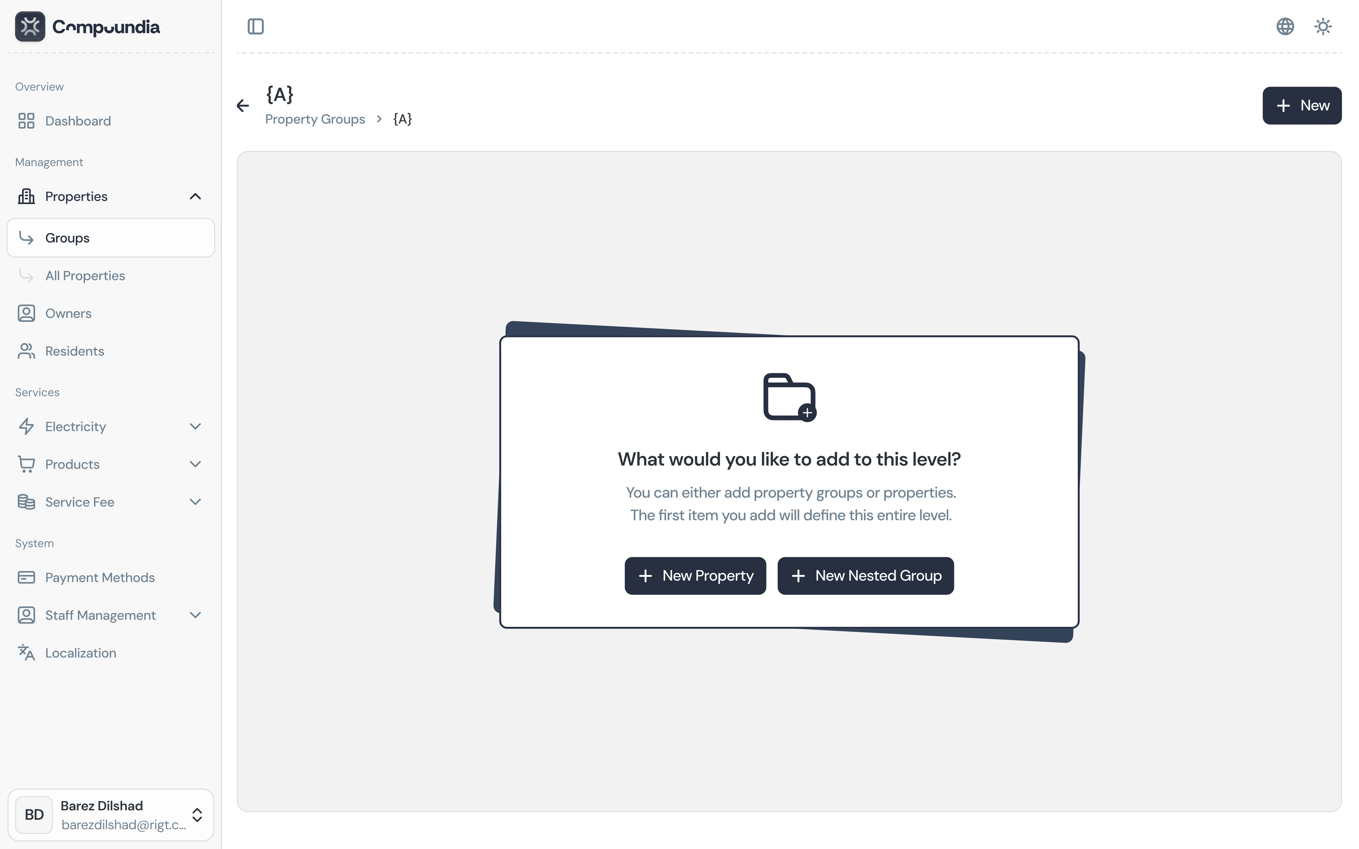
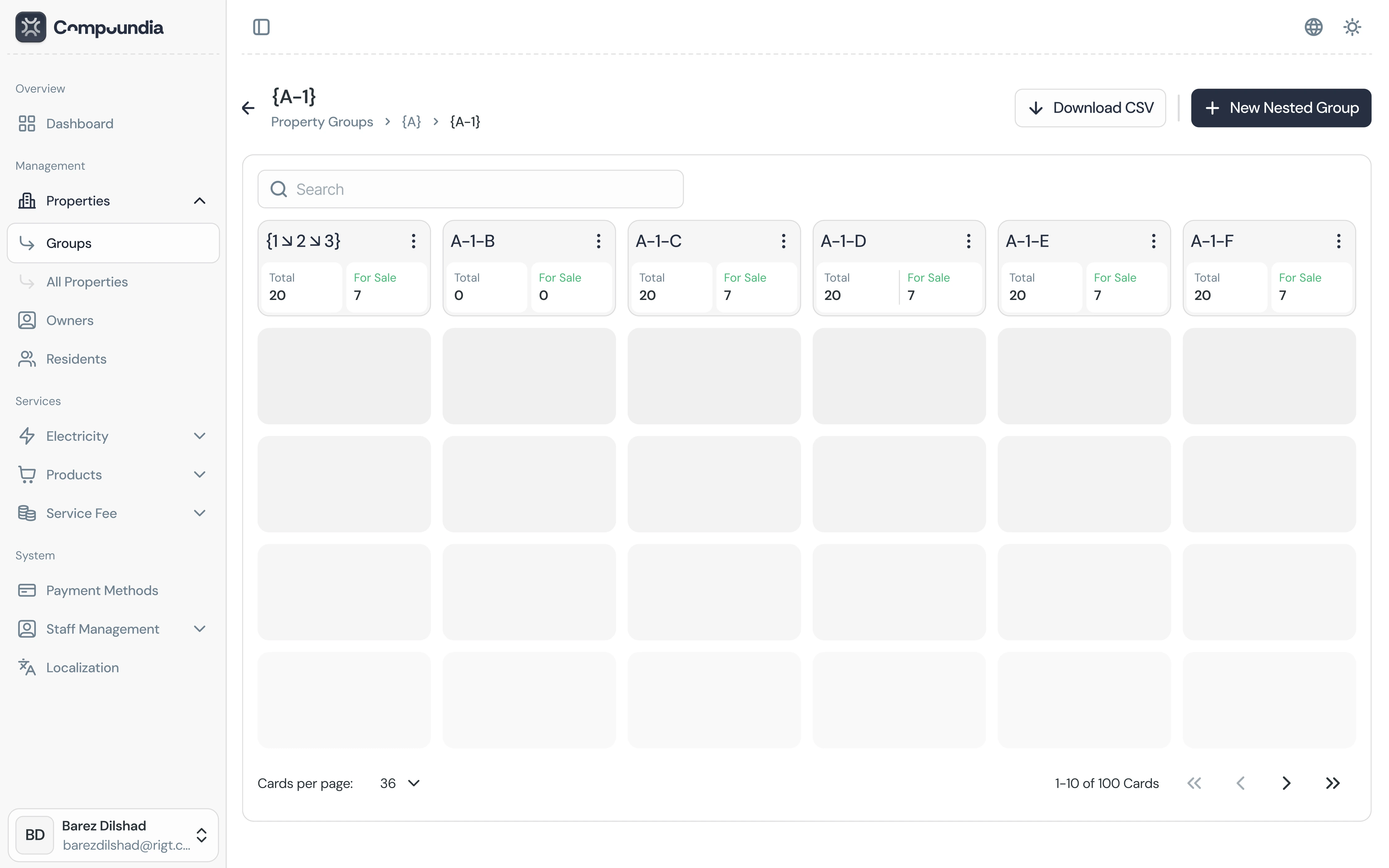
Nested properties
06 / 07Property groups make nesting explicit: a list you can scan, row actions where you need them, and a path back to the wider directory so “where am I?” is always answerable.
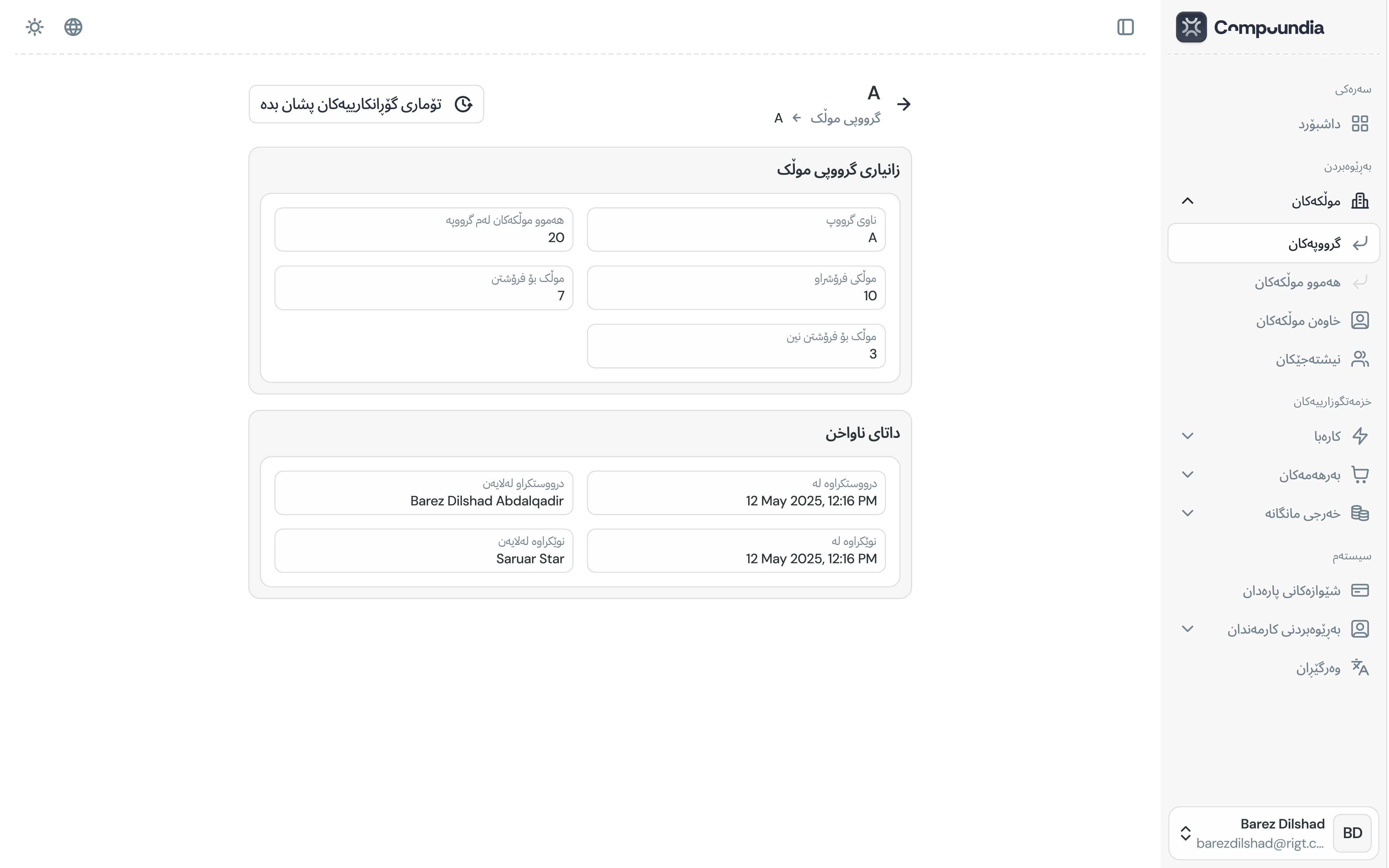
Kurdish language (RTL)
07 / 07The same components mirror cleanly for Kurdish RTL: navigation, tables, and form rails flip without breaking alignment, so localized staff get parity with the English layout — not a squeezed afterthought.
Results · Key takeaways
Compoundia is a full admin UI story told through reusable pieces: portal, dashboards, forms, iterators, careful actions, hierarchy, and RTL — all with one visual language so the product feels designed as a system, not as disconnected screens.
Key takeaways
- Admin work is mostly scanning and deciding — tables, filters, and iterators deserve as much craft as marketing pages; rhythm and alignment are the product.
- Forms and “dangerous” flows need different tones — retrieved states and stepped actions build trust when the data is real and mistakes are costly.
- RTL is a layout constraint from day one — mirroring navigation and content rails early keeps Kurdish from feeling like a patched translation of English.