BestBid Redesign
A clearer local bidding experience — discovery, live bids, and checkout without the noise
2026·Product Design

Background
BestBid is a local bidding marketplace where people browse listings, place bids, and complete purchases in their region. The product spans discovery, item detail, active bidding, payment, and confirmation — all on tight mobile-first timelines where seconds and clarity matter.
I led a redesign pitched as an evolution of the existing app: keep the trust and habits of current bidders while modernizing hierarchy, reducing visual noise, and making bid status and checkout feel unmistakable at every step.

The Problem
The previous experience felt dated and crowded: weak focal hierarchy on the home feed, inconsistent cards and typography, and bid state that was easy to misread when listings were active or closing soon.
Downstream flows amplified the friction: item detail buried pricing and time pressure, the bid sheet mixed competing actions, and payment didn’t always read as a single confident path from commitment to done.
There was also an opportunity under the visual pass: dark mode and calmer surfaces for evening use, without losing contrast on prices, timers, and primary actions.

What I did
I benchmarked regional and global auction and classified apps — how they surface time left, outbid states, and payment reassurance — so patterns felt familiar to local users without copying wholesale.
I folded rationale into a stakeholder-ready pitch tying each screen to retention, bid completion, and fewer drop-offs at payment.
Through exploration and hi-fi execution I worked within BestBid’s brand — accent color, type, and tone — so the redesign reads as intentional evolution, not a disconnected reskin.
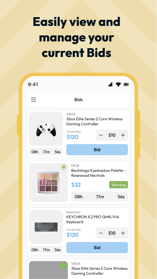
Home & discovery
01 / 06Rebuilt the feed around scannable listing cards: clear imagery, price and bid cues, status chips, and a calmer chrome so browsing feels fast rather than overwhelming.
Item detail
02 / 06Clarified gallery, seller context, current bid, and time remaining so evaluation and the primary bid action stay in one visual column without scrolling guesswork.
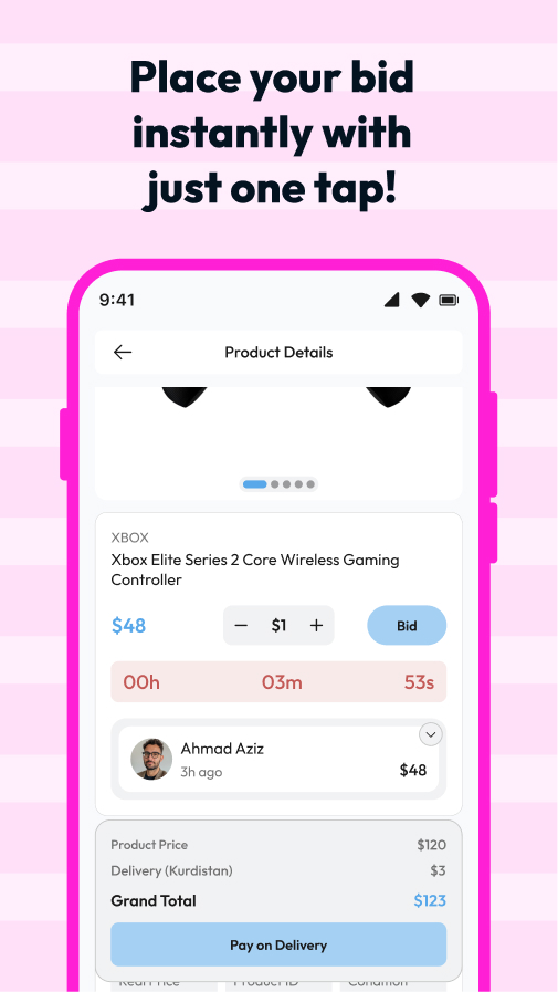
Bidding
03 / 06Dedicated bid UI with explicit amounts, increment hints, and outbid feedback so users always know whether they’re leading or need to act again.
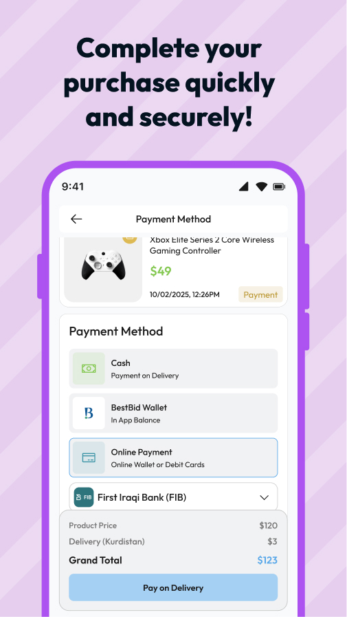
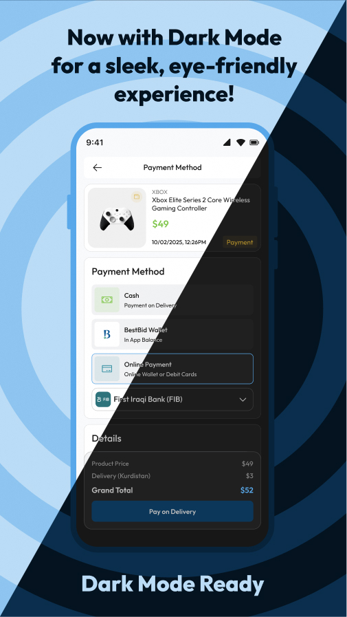
Payment
04 / 06Streamlined checkout: method selection, order summary, and a single primary pay action so commitment feels final and understandable.
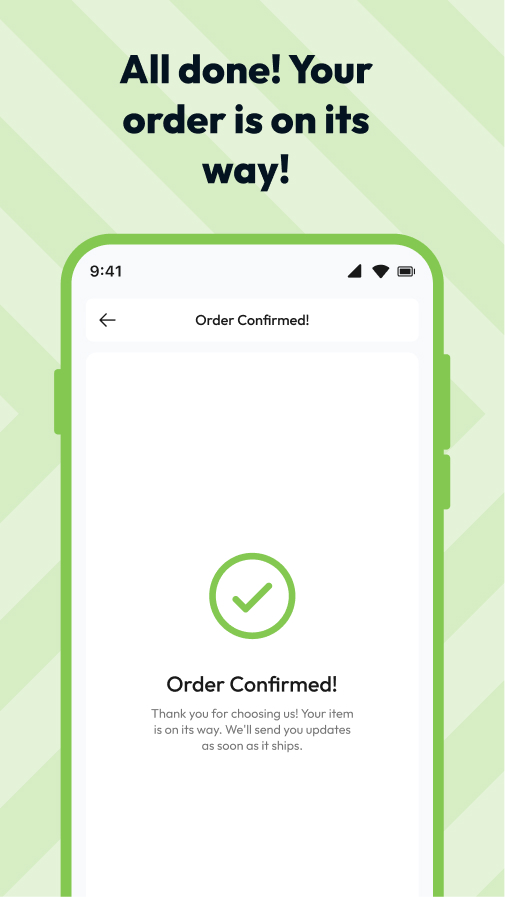
Confirmation
05 / 06A clear success state after payment — what happened, what’s next, and how to return to browsing without losing context.
Dark mode
06 / 06Extended the system to dark surfaces with preserved contrast on prices, timers, and CTAs so the app stays legible in low light.
Results · Key takeaways
The redesign exists as a specified UI direction and pitch; without live analytics, outcomes are framed as design intent: faster read of bid status, clearer paths from browse → detail → bid → pay → done, and a marketplace that feels like one system in light and dark.
Key takeaways
- Auction UX is time UX — timers, outbid states, and primary actions need hierarchy as disciplined as checkout; ambiguity costs bids.
- Payment and confirmation are trust surfaces — users need to see totals, method, and closure in sequence; a polished home can’t compensate for a shaky pay step.
- Dark mode is a product mode, not a theme toggle — prices, badges, and CTAs need explicit contrast passes or urgency signals disappear.