Arbela Redesign
Brand evolution, clearer hierarchy, smoother checkout journey
2026·Product Design
Background
Arbela is a local e-commerce platform aimed at shoppers in Iraq and Kurdistan, with pricing and patterns tuned for that market (IQD, delivery messaging, contact details grounded in Erbil, and related logistics cues). The product spans web and app, with a dense homepage, standard PDP and cart flows, and a multi-step checkout (cart → address → payment).
I led a strategic redesign pitched as an evolution of the brand and UI: keep what worked for existing customers while bringing the experience closer to modern regional and global storefronts - clearer hierarchy, stronger merchandising, and less friction through checkout.

The Problem
The previous experience read as generic and uneven: heavy reliance on flat white layouts, weak focal points, inconsistent corners and components, typography that didn’t feel web-friendly, and spacing that felt either empty or cluttered depending on the breakpoint. Brand cues were easy to miss, so the store felt less distinctive and less designed end-to-end.
Downstream screens amplified that fragility: the PDP didn’t consistently support evaluation and confidence (variants, pricing, delivery expectations). Checkout mixed complex totals (discounts, logistics, tax) with cart grouping by seller and address and payment selection - easy to overwhelm users if layout and sequencing aren’t disciplined.
There was also a real product requirement under the visual redesign: the experience needed to work as English LTR and Kurdish RTL, and to scale down credibly on mobile - not only desktop.
What I did
I spent several weeks benchmarking what’s out there - regional and global e-commerce marketplaces - with attention to catalog patterns, promo density, checkout steps, and how sites signal trust before purchase. That research grounded every layout decision so we weren’t fighting conventions shoppers already understand.
I folded patterns and rationale into a stakeholder-ready pitch deck so leadership could see the audit, proposed IA and modules, and how each surface ties back to Arbela’s goals.
Through exploration and hi-fi execution I worked within Arbela’s brand guidelines - color roles, typography, and tone - so the redesign reads as an intentional evolution of the brand, not an unrelated reskin.
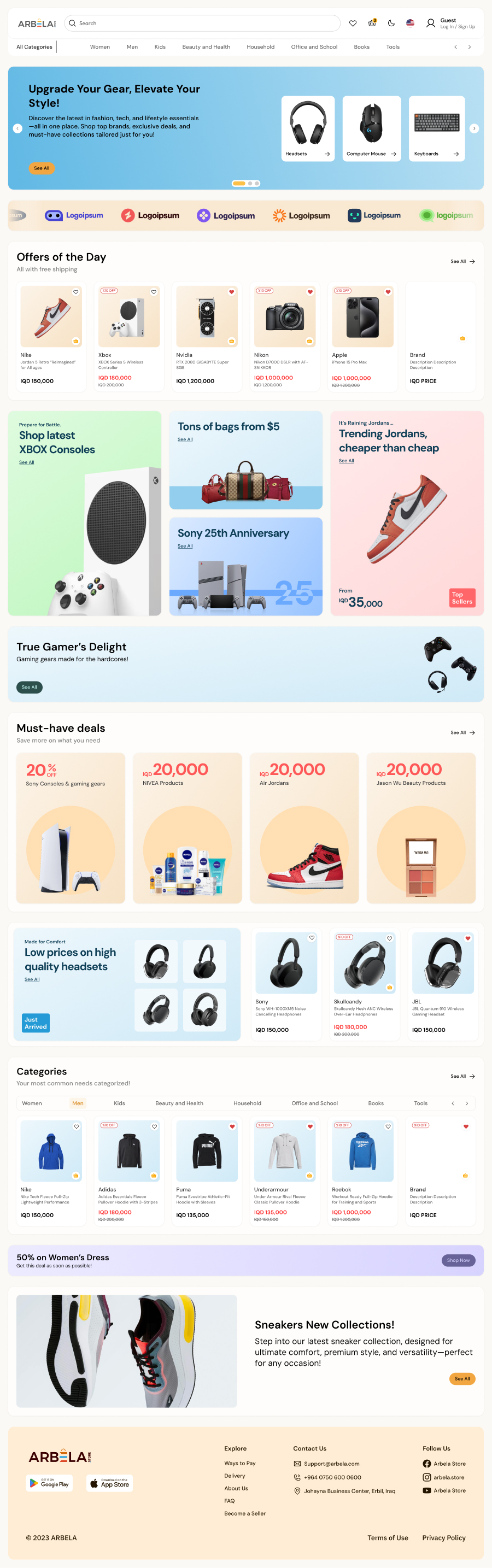
Homepage
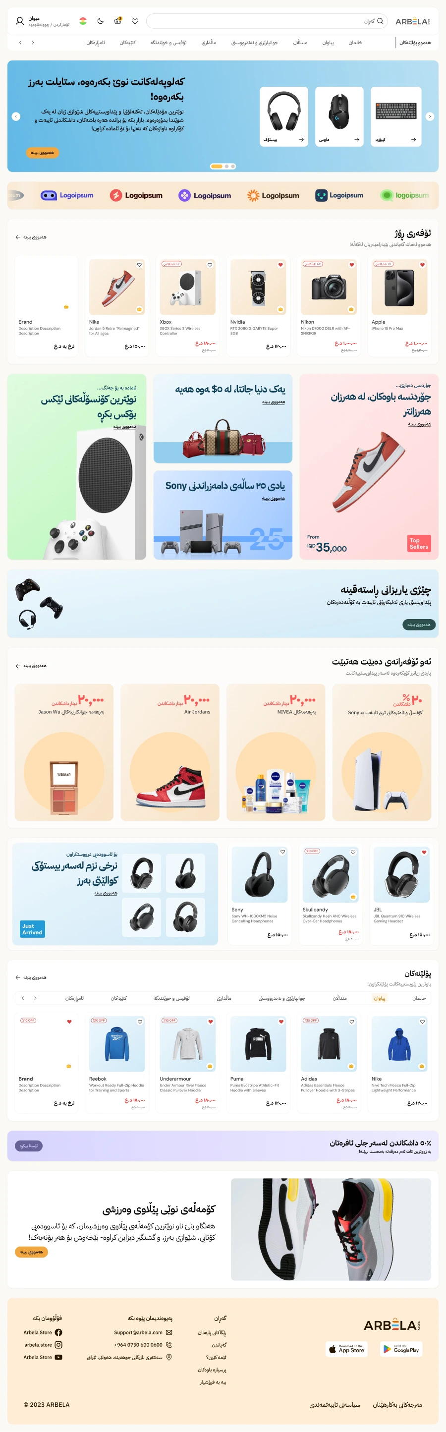
01 / 07Rebuilt the storefront around modular merchandising: hero, brand strip, offers, promo and bento blocks, category rails, and footer - all with consistent radius, spacing, and accent so scanning and scrolling feel intentional rather than repetitive.
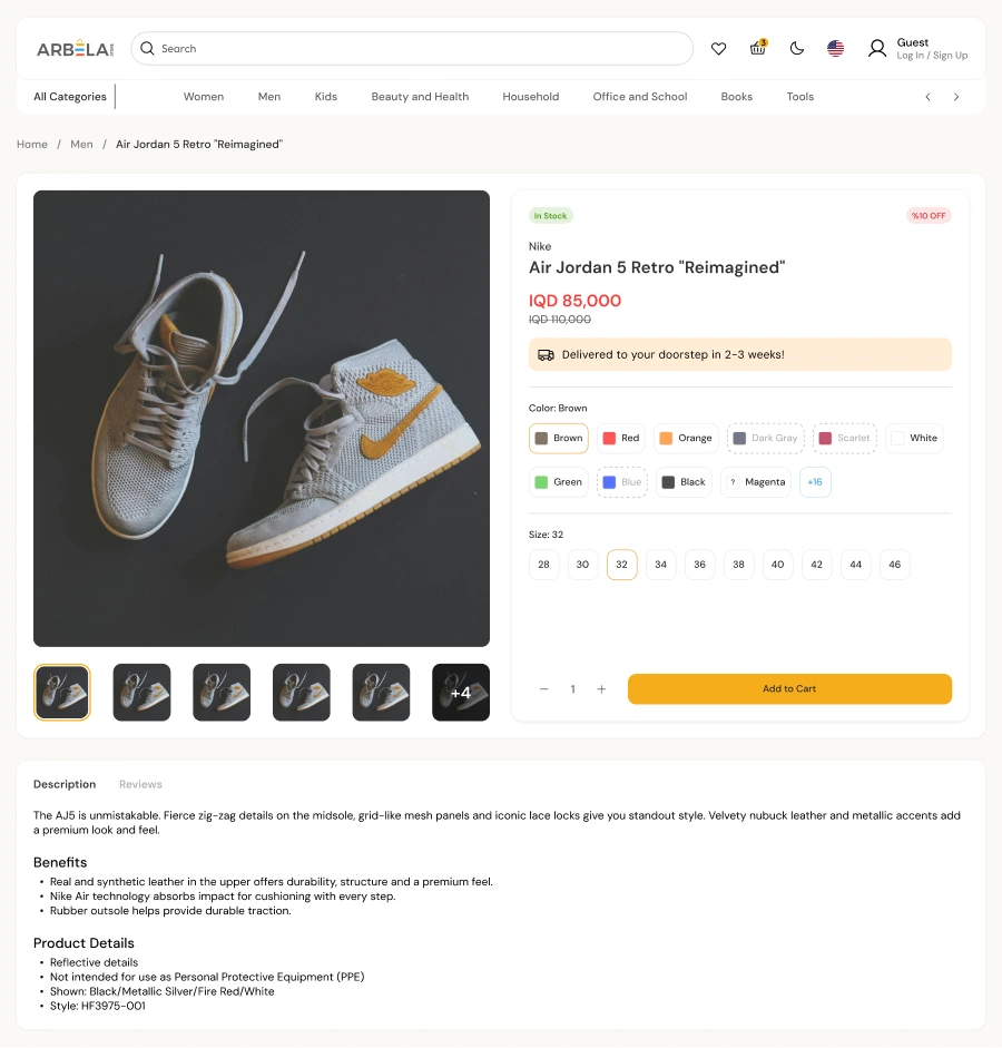
Product detail
02 / 07Clarified information hierarchy (badges, price and discounts, shipping promise), gallery and thumbnails, structured variant selection (color and size), and description vs reviews without burying purchase actions.
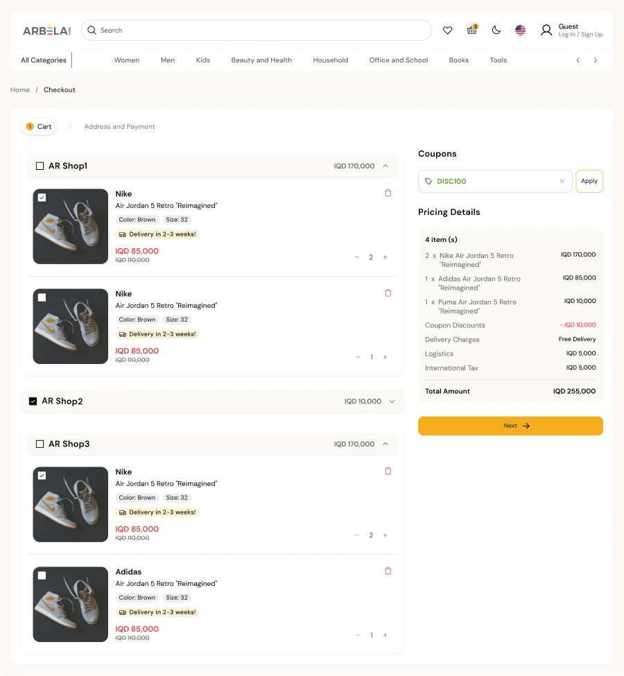
Cart
03 / 07Shop-grouped line items, selectable rows, coupons, and a line-by-line breakdown before moving to address and payment.
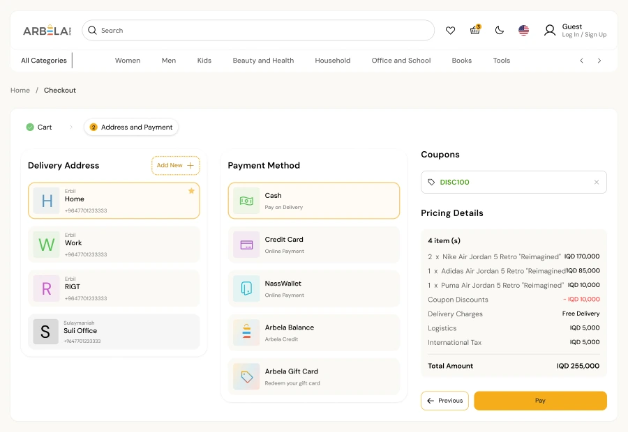
Address and payment
04 / 07Saved-address cards, payment methods, and a persistent order summary so totals stay understandable while users choose delivery and how to pay.
Kurdish (RTL)
05 / 07Mirrored navigation, localized chrome, and the same grid logic as English so RTL never felt like an afterthought.
Mobile
06 / 07Same modules on a narrow column with denser vertical rhythm so the storefront still reads as one system on small screens.

Supporting artifacts
07 / 07Pitch deck and audit-to-proposal narrative documented rationale for stakeholders and aligned engineering and product around scope.
Results · Key takeaways
The redesign primarily exists as a specified UI direction and pitch; without live analytics, outcomes are framed as design intent: clearer paths from browse → PDP → checkout, fewer ambiguous totals at payment time, and a storefront that reads as one cohesive system instead of disconnected templates.
Key takeaways
- Marketplaces need hierarchy twice - once on the homepage for discovery, again in checkout where grouping and math compete for attention; both need deliberate typography and containment.
- “Redesign” isn’t skin-deep: PDP and checkout are where trust is won or lost; investing there prevents a polished homepage from feeling hollow.
- RTL and mobile are design constraints, not polish passes: decisions about navigation, grids, and promo modules have to hold when mirrored (Kurdish) and tightened (mobile), or the system fragments under real use.